Kim Beil, Ph.D., is an art historian who teaches at Stanford University. Her book, Good Pictures: A History of Popular Photography (Stanford University Press, 2020) tracks 50 stylistic trends in the medium since the 19th century. Much of her research was drawn from vintage how-to manuals. Beil has also written about photography and climate change for The Atlantic, on screenshots for The Believer, Google streetview for Cabinet, and most recently, for The New York Times, about hiking 50 miles to track down a little-known Ansel Adams photograph in the High Sierra. She also writes about contemporary art and artists for Artforum, Art in America, BOMB, and Photograph magazines.
How do I know what I think until I see what I say?– E.M. Forster
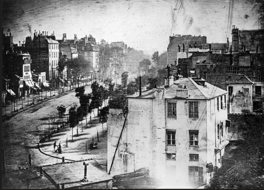
The newspapers were full of pictures. Well, not exactly pictures. Descriptions of pictures. Here’s a famous one: a picture of a wide Parisian boulevard, empty except for a man having his boots blacked. You know this picture. After seeing it at Louis Daguerre’s studio, the American painter and inventor Samuel F. B. Morse described the image in a letter, which was then reproduced in the New-York Observer in April of 1839.
Others described the new Daguerreotype pictures, too, especially their uncanny detail and fidelity to nature. Writer Edgar Allan Poe exclaimed in an 1840 article that “all language must fall short of conveying any just idea of the truth” of the daguerreotyped image. And yet, language was all he had. Newspapers and magazines wouldn’t be able to reproduce photographs in their pages for at least another 50 years.
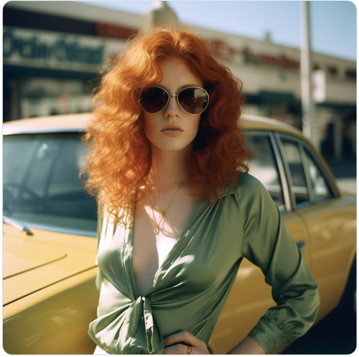
Now, almost two centuries after Morse and Poe marked Daguerre’s discovery, the news is full of descriptions of pictures again. This time, the pictures aren’t exactly photographs, even if they’re often described that way. For example: “Grainy overexposed photo of an early morning in Suburbia [sic].” Or, “1970s, medium-closeup, Ektachrome, 25-year-old woman, curly red hair, freckles, vintage car, downtown Los Angeles, green silk jumpsuit, plunging neckline, oversized sunglasses, golden hour.” These descriptions were written by the creative director Nick St. Pierre and posted on the social media platform formerly known as Twitter. Although they are related to images, these words predate their visual accompaniments. St. Pierre’s descriptions of photos are actually prompts for the AI image generator MidJourney. In 2023, the description creates the image, and yet all language may still fall short of any just idea of the truth.
AI raises the stakes for photography and for truth. In cultures that have come to rely on the standard of evidence provided by photographs, fabricated images easily created by AI represent a serious threat to public knowledge. Photographic manipulation using more analog means was widespread in the USSR and, more recently, in contemporary Russia by under Vladimir Putin. Doctored images are also regularly released by North Korean state media.
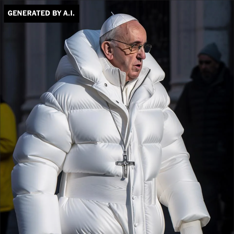
But in a democratic society, citizens are entitled to a free press, whose responsibility it is to make visible the work of elected officials and other government representatives. We expect this reporting and imagery to be accurate and authentic. Reputable news organizations extensively vet their photographers and submit images acquired by other means to rigorous analysis to confirm their veracity and context. However, with the rise of the so-called democratic publishing platforms of social media, many of the newsworthy images that are now widely seen on the internet are not subjected to the same level of scrutiny. This is how we found ourselves wondering, early in 2023, why Pope Francis was wearing a puffer jacket. The image was created using MidJourney by a 31-year-old apparently tripping on mushrooms, not a photojournalist on assignment in Vatican City.
While efforts at effective digital provenancing, such as the Content Authenticity Initiative, are slowly moving through the news world, they won’t reach all digital publishing platforms. We need to teach viewers to be better, more skeptical viewers of the images they see and believe to represent the truth. To this end, AI might offer a small step towards a solution. I want to suggest that AI image generators, like MidJourney, as well as DALL-E and Stable Diffusion, are also training us, but not in the way we might expect—and they might even be training us to more effectively spot their trickery.
"We need to teach viewers to be better, more skeptical viewers of the images they see and believe to represent the truth. To this end, AI might offer a small step towards a solution."
In this essay, I’m going to back up one step and consider the important role of text in making AI pictures, a feature that has gone largely overlooked in discussions of AI image creation. Most introductory articles address text only in a short gloss on the process: a user enters a prompt into an AI image generator and then the software spits out a selection of images that interpret this prompt in different ways.
For example, when I enter “a picture of a wide Parisian boulevard, empty except for a man having his boots blacked” into DALL-E, I get four black-and-white naturalistic renderings of Parisian boulevards. Perhaps the AI recognized my anachronistic language and assumed I was looking for a black-and-white image, even though none of these are photorealistic? All four have the brushy character of an ink wash drawing and they achieve the feeling of the boulevards with sunlight filtered through rows of plane trees. Two of the four include contemporary cars on the street, but the other two are mysteriously atemporal. The tall thin man in the overcoat shown in one picture may as well be Edgar Allen Poe.
You can be as vague or as specific as you want with a prompt, and the AI image generator will fill in the gaps, whether in the detail it adds to the scene or the style in which it is rendered. The point is that there are always gaps. You could exhaust yourself with the proverbial “thousand words” and still find that you haven’t described everything in the picture.
Although the adage “a picture is worth a thousand words” seems metaphorical, when it was first used, the phrase was more quantitative. Prior to the invention of halftone printing, the difficulty and expense of engraving and reproducing images in print meant that pictures were literally more valuable than words. As a result, the archive is full of texts that describe pictures, sparing their publishers the cost of printing images. Sometimes, as in the 1862 New York Times review of Mathew Brady’s pictures at Antietam, the newspaper simply instructed readers to go to the gallery themselves to look at the pictures in person.
Then there were the specialist publications, such as an 1875 guide to Pictures in the Royal Academy. It tells me about the painting titled “Mrs. Finch,” by G. A. Storey. Had I visited the Academy that year, I might have seen a “portrait of a lovely lady leaning over a balcony.” What made her lovely, what she looked like, what she wore, whether there were clouds in the sky, how high the balcony was, what the paint looks like on the surface of the painting – all of this is absent from the description. Then there’s No. 29. “Portrait of H. S. Marks,” which the catalog describes as “a real portrait, nearly life-size; accurate and full of character.” But what made it accurate, I will never know.
Sometimes these descriptions are all that remains of an artwork. They are tantalizing but incomplete. I would like to know, for example, what exactly was depicted in the “two daguerreotypes” listed in an 1849 catalog for the Boston Museum. I wish I could see the “Photograph, taken at night, of the burning gas from the Conroy & Johnson Well” that was exhibited in 1889 at the Paris World’s Fair. I want to know more about the microscopic photograph of a spider that Daguerre made and Morse described, but was lost in Daguerre’s studio fire. In these cases, and many others, a silhouette of words is all that remains.
Even with a thousand words, a writer is hard-pressed to re-create a picture fully. If you sit down and try to describe everything you see, you’ll quickly exhaust yourself with naming every element in the frame, describing their spatial relationships, the color and tonality or the surface quality of the object. Introduce a human subject and all is lost. How to describe precisely the pose, let alone the expression? What is the lady leaning over the balcony thinking or feeling?
What strikes me about the nineteenth-century texts is how little they actually describe of the image. Unlike DALL-E prompts, these texts are mere suggestions. I am the intelligence that has to fill in the gaps, whether through imagination or a trip to the gallery.
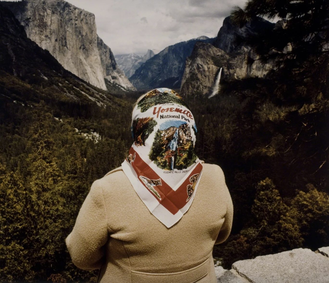
As a historian of photography, I’m always describing pictures. Sometimes it’s to hedge against the possibility that there will be no reproductions to accompany my writing or to help readers see the picture in the way that I’m seeing it. But the most frequent way I describe pictures is this: “woman wearing scarf in front of Grand Canyon.” Then I click “search” and look through the results. And finally I remember that the picture I was trying to find is by Roger Minick and it’s actually Inspiration Point in Yosemite, not the Grand Canyon. Or I search “shopping cart in parking lot, 1960s.” And, obviously, the shopping cart is William Eggleston’s, but in my mind I’ve merged it with his tricycle picture. My remembered description can only get me so far.
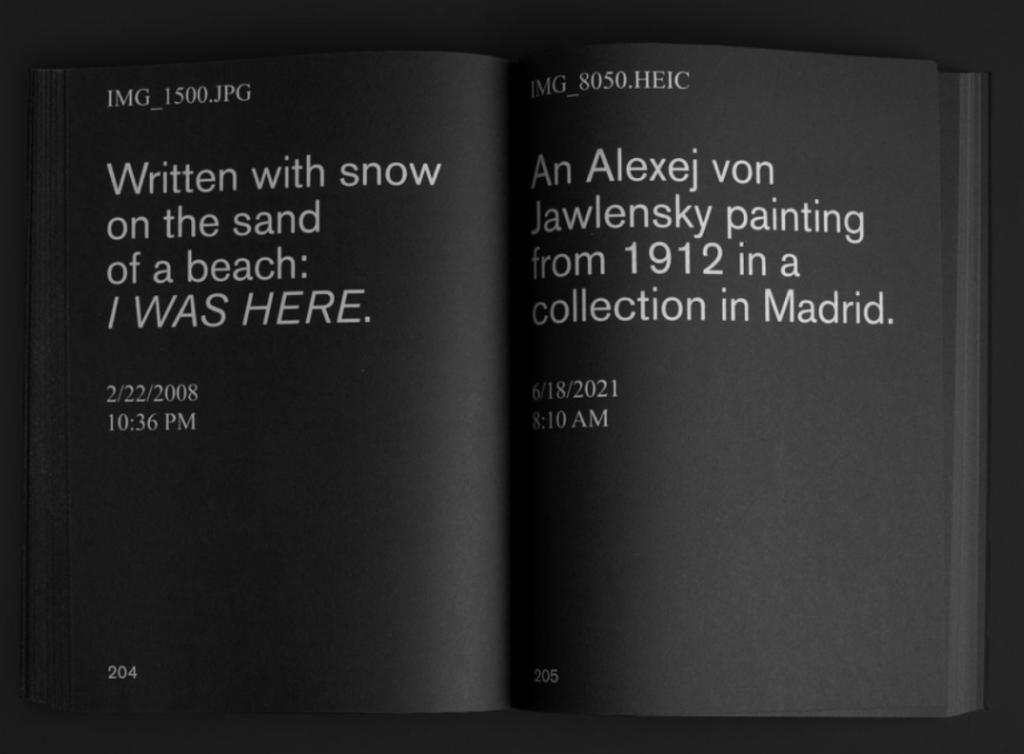
My Google image search history reads like David Horvitz’s project called Nostalgia. The artist selected thousands of digital images from his personal archive. When shown publicly, each image is displayed for one minute on a screen. After it is shown, it is deleted. Forever. All that is left is Horvitz’s memory of those images—and descriptions he wrote of them. He collected some of these descriptions, along with file names and dates, in a book published by Gato Negro in 2019. They include “IMG_9906.jpg View through the windshield driving through automatic car wash. 11/28/2017 3:37 pm” and “IMG_6703.jpg Daniel getting massaged by a woman on a beach in Italy. 7/22/2018 2:10 pm.” The titles read to me like they could be DALL-E image prompts working backwards, from image to text.
Another DALL-E inversion is a recent project by David Campany, who has been making photographs that look like DALL-E images. The interest in looking at these pictures is not in appreciating the images, but in imagining what prompts could have generated them. The image of sunlight reflecting in a blue swimming pool would be easy to create, but should one describe the lens flare that appears over the lavender field, or would DALL-E add that on its own?
When prompting DALL-E, the program offers suggestions such as: “Mention styles, like ‘pixel art.’” Or: “Add ‘digital art’ for striking and high-quality images.” One online tutorial recommends, “If you're aiming to create photorealistic images, try including a camera model, focal length and type of lighting (‘studio lighting’, ‘soft lighting’, ‘deep shadows’, etc).” And this is why I want to recommend DALL-E: not for the strength of its images, but for the way it is training users to be better describers and viewers of photographs. These descriptions can also help us understand what people are looking for in photographs. Studying the revision of prompts might help us pin down subjective descriptions, or chart shifts in what users think of as “good” composition or “nice” lighting. In spotting fakes, it pays to know what fakes—and real things—really look like. What does AI’s “photorealistic” imagery look like? Where does it fall short? What lens-based elements are lacking? Where does the software take shortcuts (such as its infamous trouble depicting fingers and hands, like all young artists)?
"In spotting fakes, it pays to know what fakes—and real things—really look like."
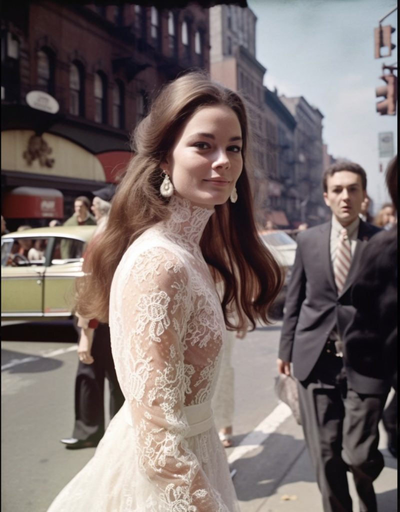
A long prompt by St. Pierre points to some of the challenges, as well as the unique opportunities that might come from studying AI users’ requests: “1960s street style fashion photo capturing a gorgeous 30-year-old woman with long brown hair, slightly blush cheeks, and a sly grin walking confidently on a bright spring morning in TriBeCa. She’s wearing a stunning white lace Gucci gown with a full tulle skirt, intricate lace detailing, long lace sleeves, a high collar, and a fitted bodice adorned with delicate floral appliques. The soft lighting and careful composition emphasize the dreamy and romantic elegance of the gown.” What counts as a “sly grin”? What is a “stunning” gown? Is it stunning for 1960 or 2023? What is “careful composition”? What does “dreamy” look like? How do these requests change from user to user and over time?
The poet Mark Doty begins his book on descriptive writing like this: “It sounds like a simple thing, just say what you see.” Although Doty’s goal is to translate “world into word,” as he says, it is not much different from the challenge of describing the world in a photograph. In both, the rich and layered experience of looking is flattened by any simple statement of subject. In 1865 the Philadelphia Photographer, a photo industry publication, printed an essay recommending that photographers spend more time saying what they saw. The author, Frank Howard, suggested that photographers’ overwhelmingly prosaic titles didn’t only detract from viewers’ experience of the pictures in an exhibition, but generic titles impoverished the photographers’ future pictures. Instead, Howard counseled photographers to “study the picture to see if it really is like nature.” Looking at pictures closely like this could also train photographers to look more closely at the world itself and, thus, to find better pictures in it. Vision is fleeting; words are lasting. To understand what they have seen and to learn to look for it in the future, Howard insisted on the practice of writing descriptive titles.
My hope for DALL-E and other AI image generators is related. When we learn not just to look at pictures, but to describe them in minute detail, as if we might bring them into existence through our words alone, then we are really seeing. If I had to describe Pope Francis in Balenciaga, I would have to tell you that the finger of his right hand looks more like an octopus than a pontiff’s pointer. I would be forced to explain the fact that the turned-up collar of his chic jacket is curiously invisible when it passes behind his glasses. Taking the time to describe requires closer looking.
And DALL-E has made close-looking more important than ever, particularly when we encounter images claiming to be photographs in service of news. To preserve the ideals of the free press that are embedded in our constitution, we need to support those professional institutions best prepared to represent what they see in a fair, authentic and human way. When we encounter newsworthy images made outside these safeguards, we must learn to turn the power of AI back on itself and describe what we see, not only so that we can say what we saw (to adapt E.M. Forster’s aphorism), but so that we know what we’re seeing is the truth.
"To preserve the ideals of the free press that are embedded in our constitution, we need to support those professional institutions best prepared to represent what they see in a fair, authentic and human way."